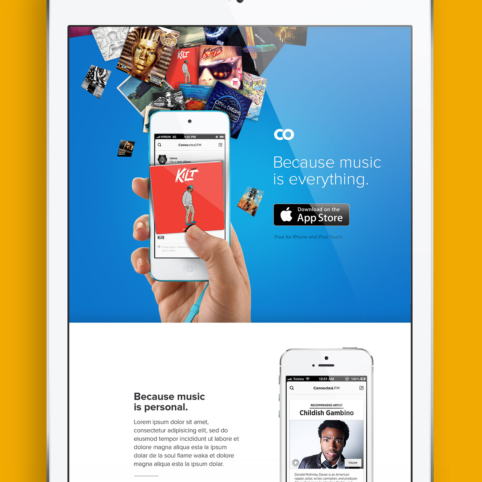
At Discovr I helped redesign the hugely popular music app used by millions.
Discovr is a music discovery app downloaded by millions of people all over the world. Built to bring you the music content you'll love. My role was to design all marketing materials and branding. I contributed various iOS interfaces, built and maintained the front-end for the marketing site and web application.
Sometimes ideas would cut through and make it into the app and sometimes they would be shelved.
February - November 2013
Senior Product Designer
Co-founders
Development Team
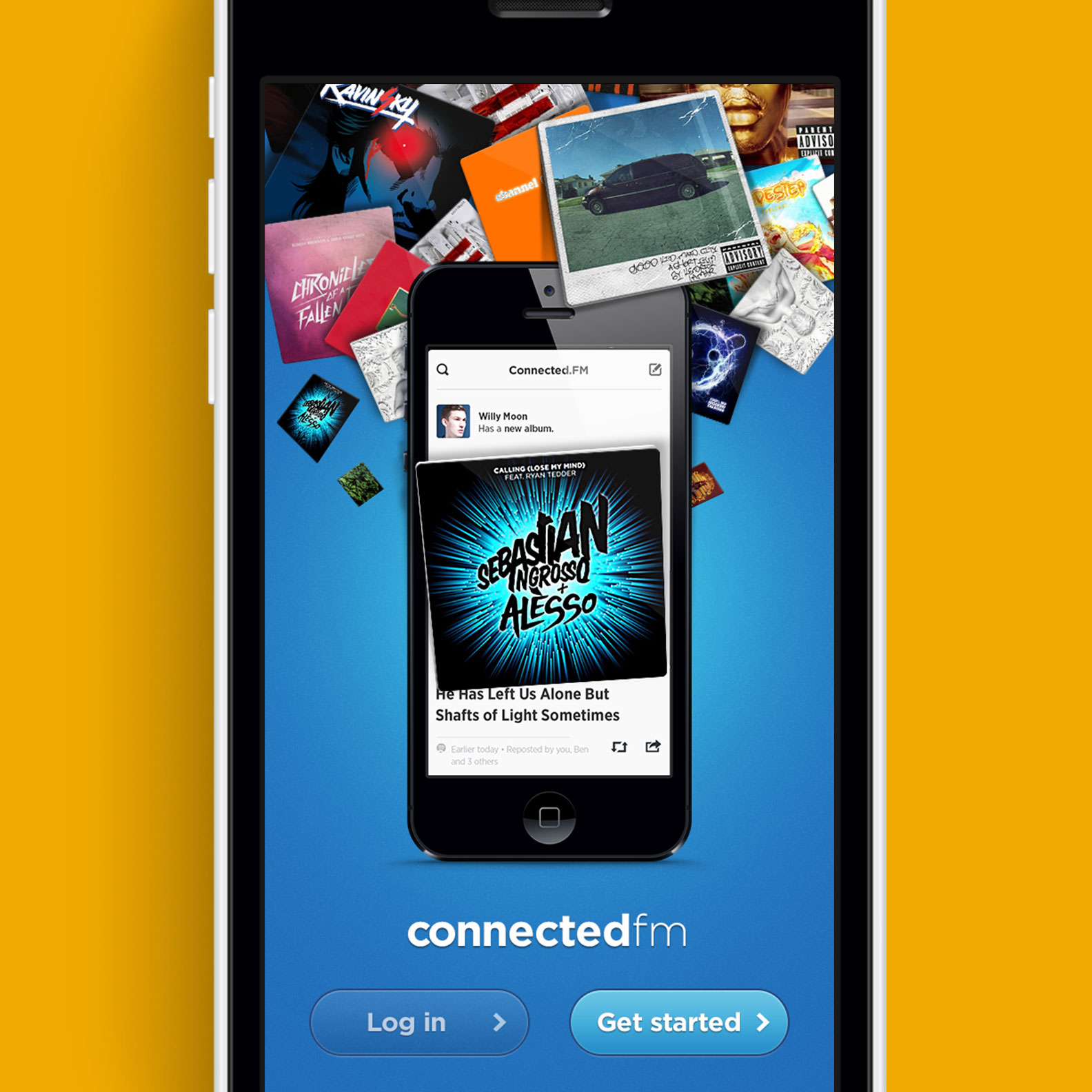
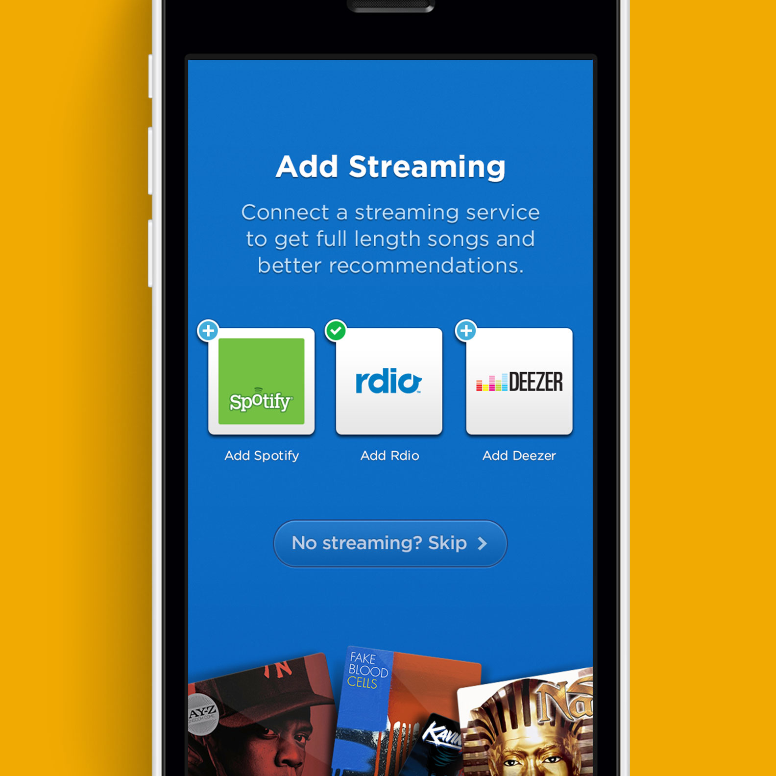
During my first few weeks on the team I spent a lot of time on crafting the onboarding process. After all its the first thing you see when you launch the app, plus we needed it to distract you while the app was collecting information to build a stream of relevant content.
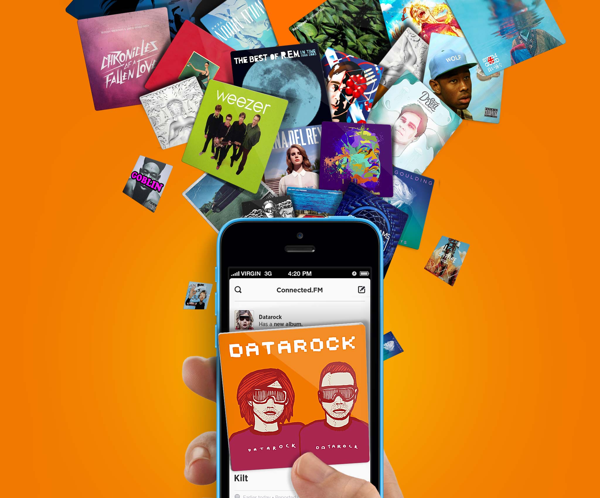
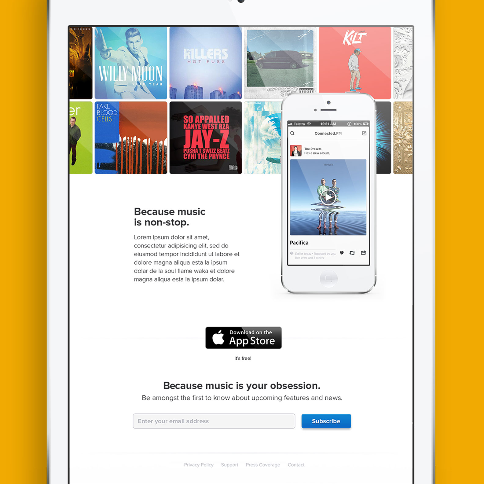
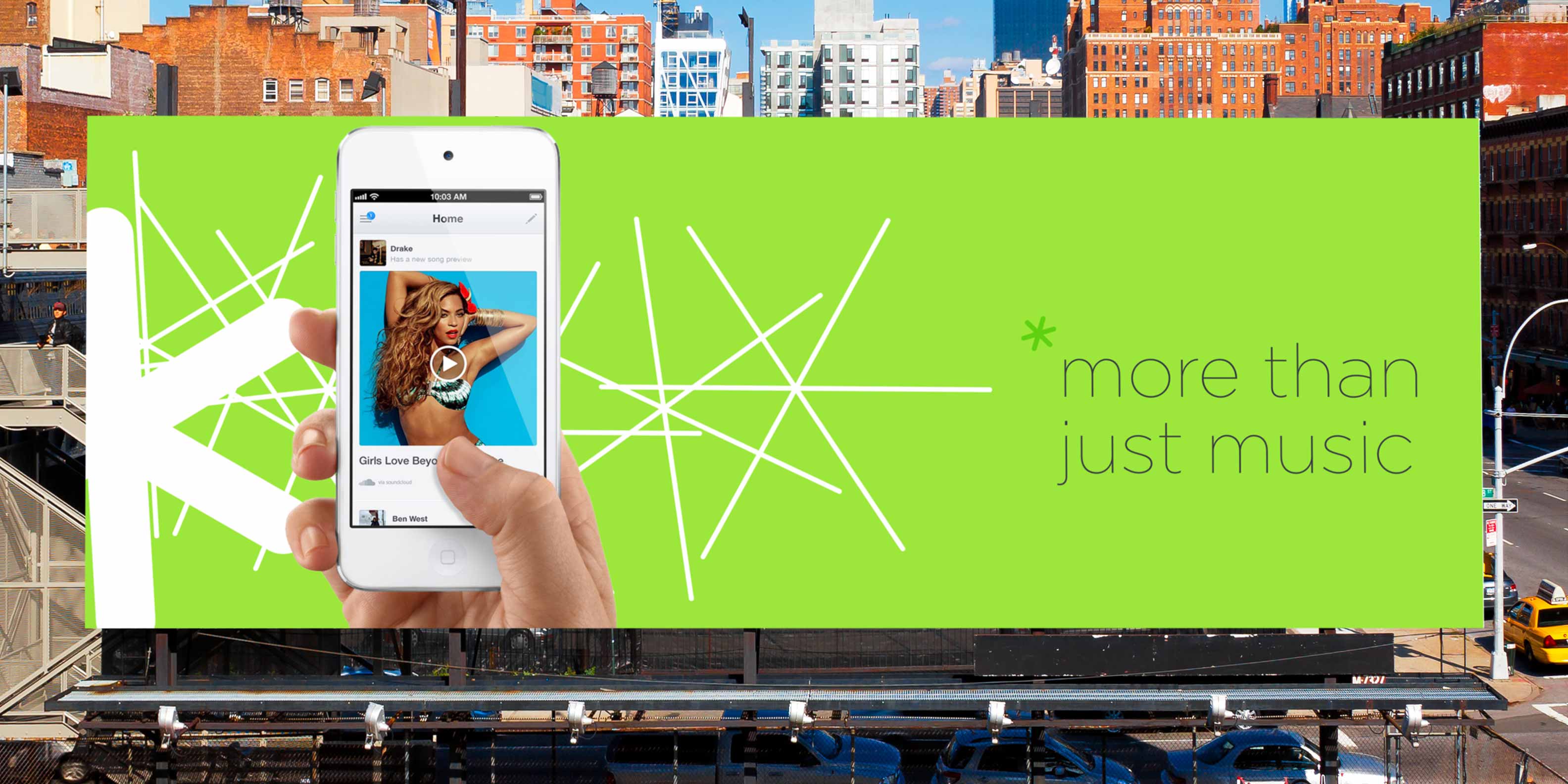
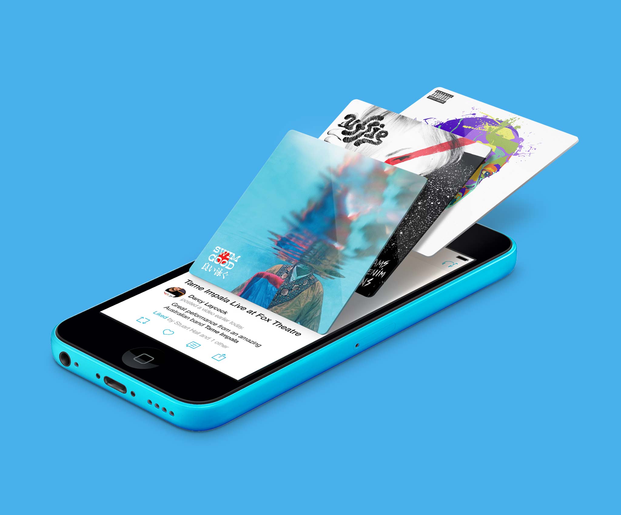
After a weeks of experimentation, we landed on a concept that was built around the idea that Discovr could "Bring you more of the music you love". When you launched the app, album artwork from your favourite artists would explode from the screen. I designed a marketing campaign, and a website to match.
It summed up the idea that Discovr was somewhat magical. Unlimited in it's range of content and thanks to some smarts we 'just knew' exactly what you liked.<


Branding has always been a challenge for me. In my many years at Ad Agencies and freelancing, I’ve never really enjoyed branding as much as I enjoyed other forms of design. It’s this subtle fear of branding that drives me to push my self incredibly hard to succeed. So when I was asked to over-hall Discovr’s branding, I pulled out all the moves in an attempt to develop a visual language that was flexible and timeless - I hoped.
I had already had one or two smaller attempts at developing a style for Discovr. But by this point many things hand changed within the product to render a new approach necessary. Over the months on this task, dozens and dozens of approaches where made.


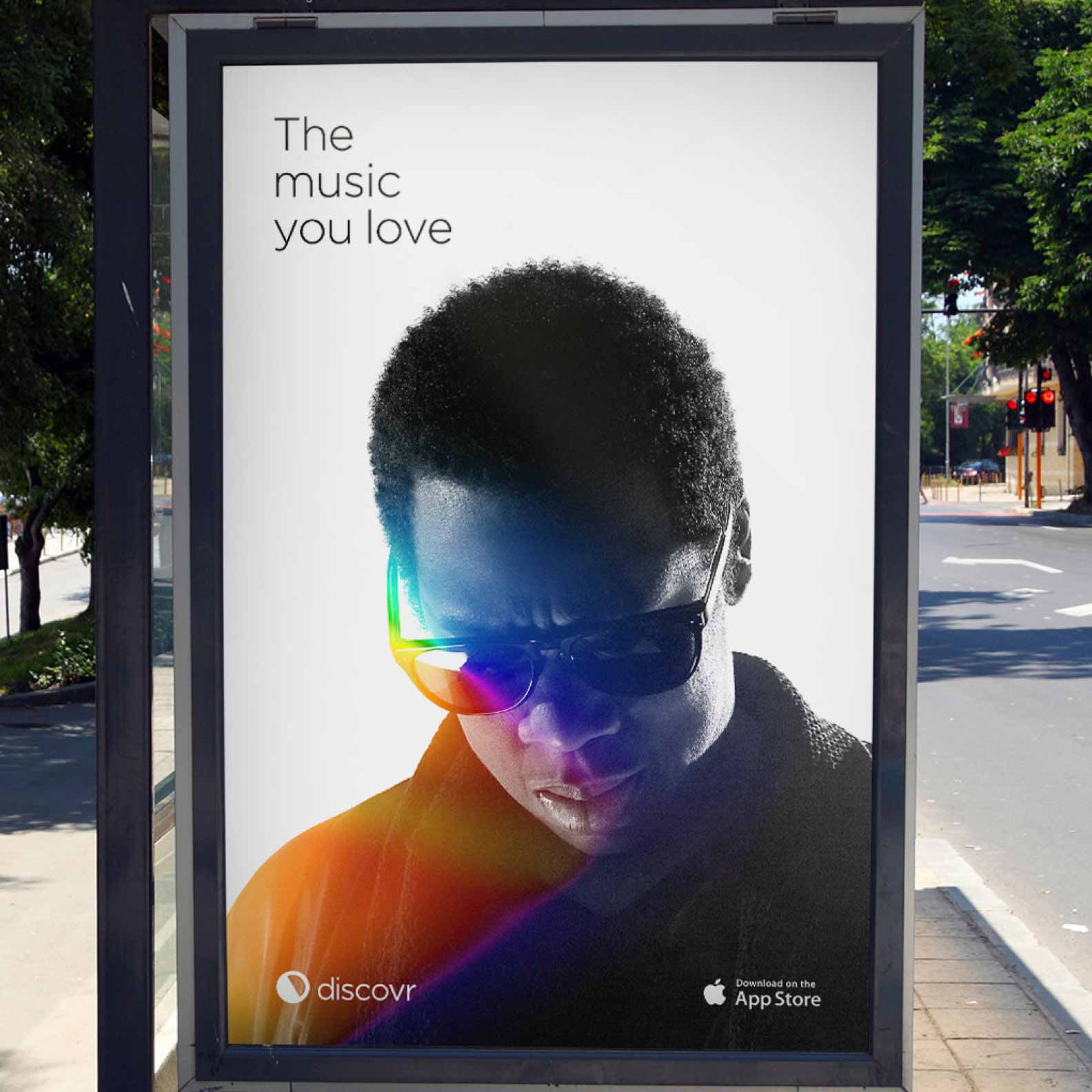
The first notable solution was the multi-facet play icon. In an attempt to display the unique feature of Discovr, its ability to aggregate Soundcloud, Rdio, Spotify, iTunes, Facebook, Instagram and other sources for music related content into one neat stream. I did also make a deliberate attempt to draw some inspiration from Pink Floyds iconic album cover.
Another notable approach focused on the idea of uncovering something new. I looked back at the days when I use to buy records, in my later teens I DJ’d at friends parties and was very familiar with the experience of digging through crates of vinyl to find that killer beat.
The iconography was designed to be reminiscent of that first pull of new record from the crate. The half exposed vinyl. I played with it on the iOS 7 icon grid and some tag lines and developed the following mark.
During the development of this mark, I used a light leak treatment. It gave the sense of being in the crowd at your favourite artists sold out concert. This treatment was very flexible, being applied to all kinds of media at photography. It would later be used with other marks and found its way into the final Discovr brand.
My favourite mark was a simplification of the already semi-famous ‘Music Map’. For those of you who don’t know, the mapping feature was the core of Discovr’s earlier versions. Millions of users world wide used this feature to explore the music world and I’m pretty happy with the execution below.
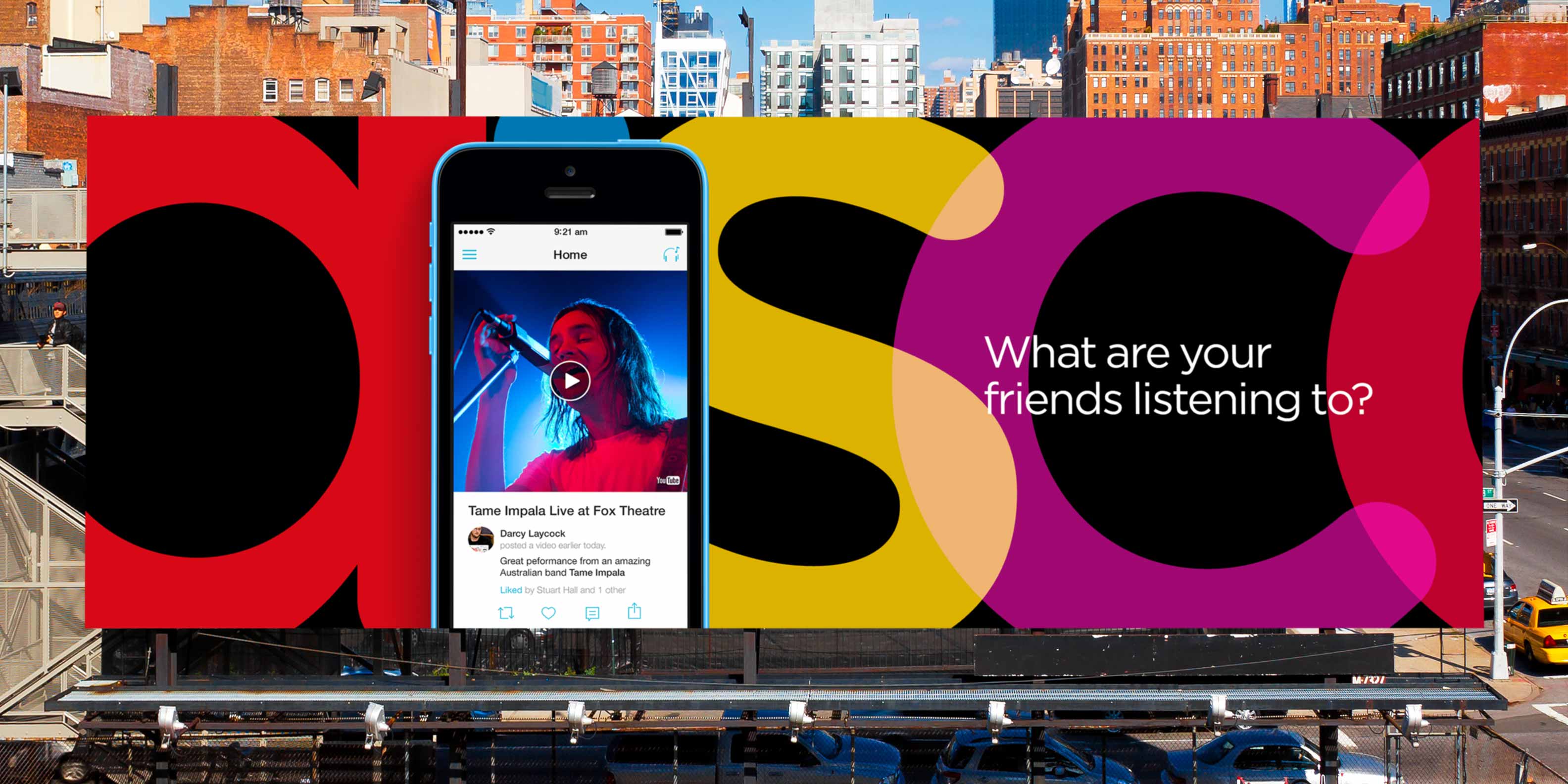
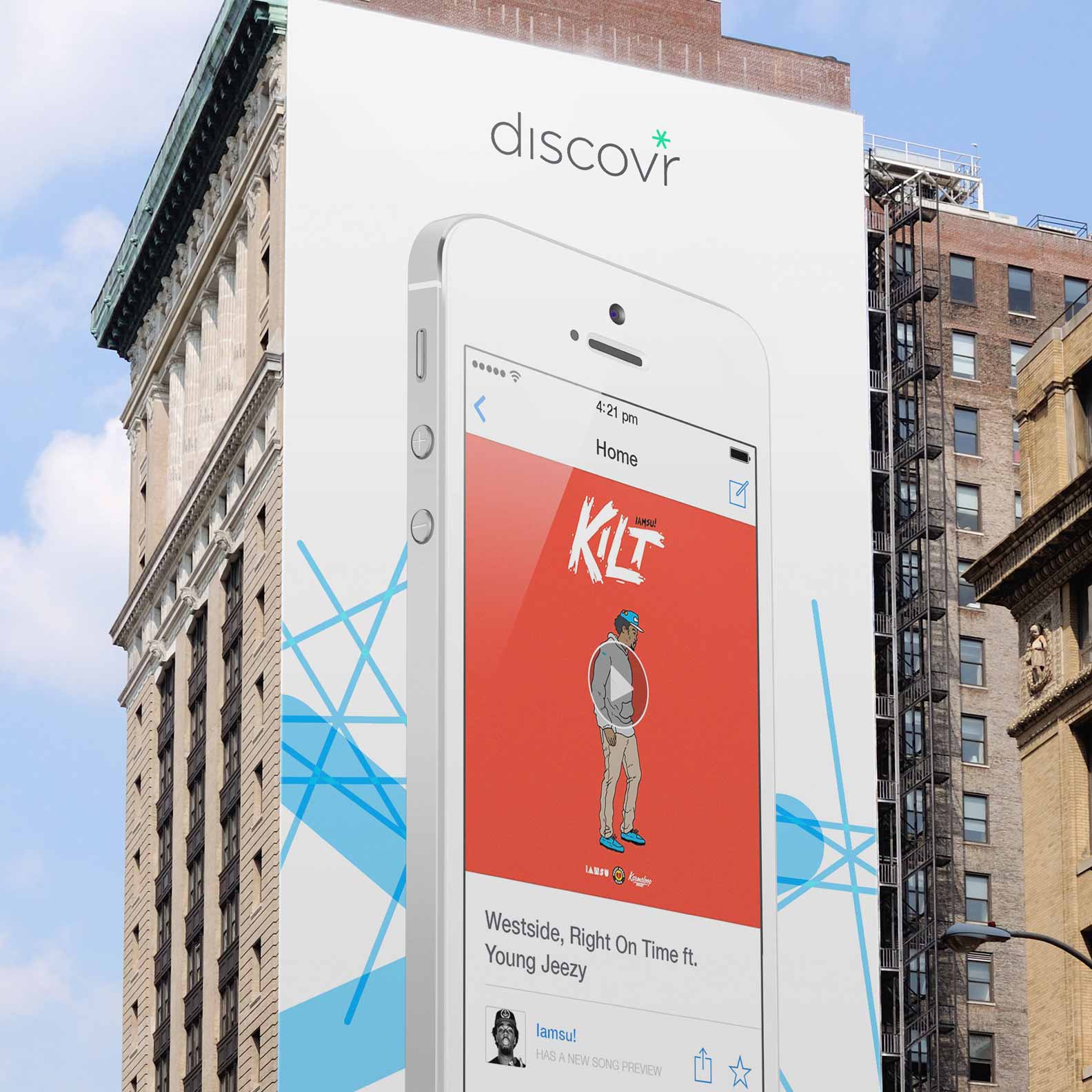
There were many other great approaches that had been created, dozens and dozens. None of them stuck because tough creating an icon that is unique, simple, relevant and ontop of that works inside a tiny icon on sits on someones homescreen.
Ultimately, we keep it simple and go with a lowercase 'd'. It looked best on the home screen and lined up well among other social app icons.
Discovr’s front-end was built by me. In fact Discovr’s homepage was the first website I ever pushed live 🙊
Sure, before Discovr, I had a very good knowledge of what could be done on the web, but I didn’t know how to actually do it. Today I can build almost any interface I can dream up. I went from spending all my time in Photoshop (Yep thats how old this project is), knowing zero code, to building a modular framework which would be help us rapidly deliver a great experience for our users.
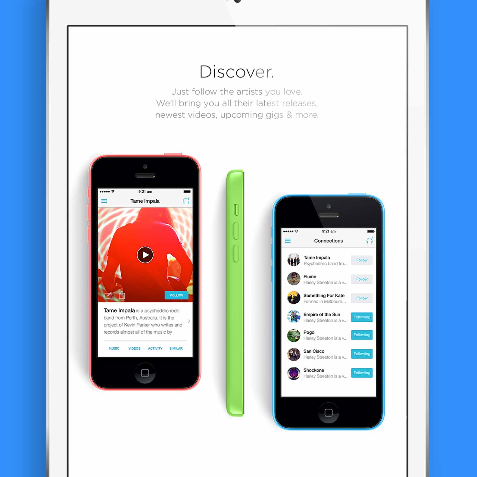
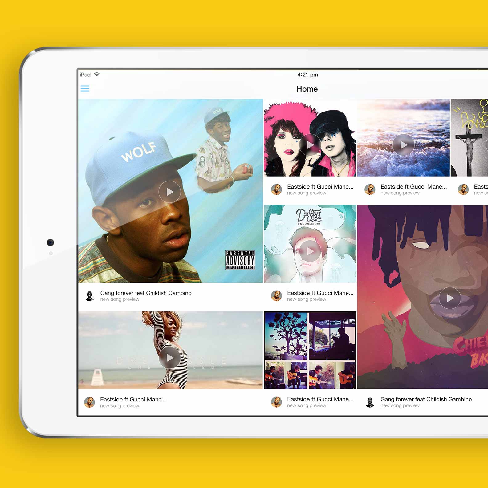
I had been tasked with designing Discovr’s marketing website, in usual fashion I designed many concepts. But while waiting on feedback for some, I build others. I had a subscription to Treehouse, an online learning platform for all things code. I couldn't recommend it any higher. I also had Callum and Darcy to point me in the right direction if I ever needed it - thanks fam. Below are just a few of the many concepts I created.
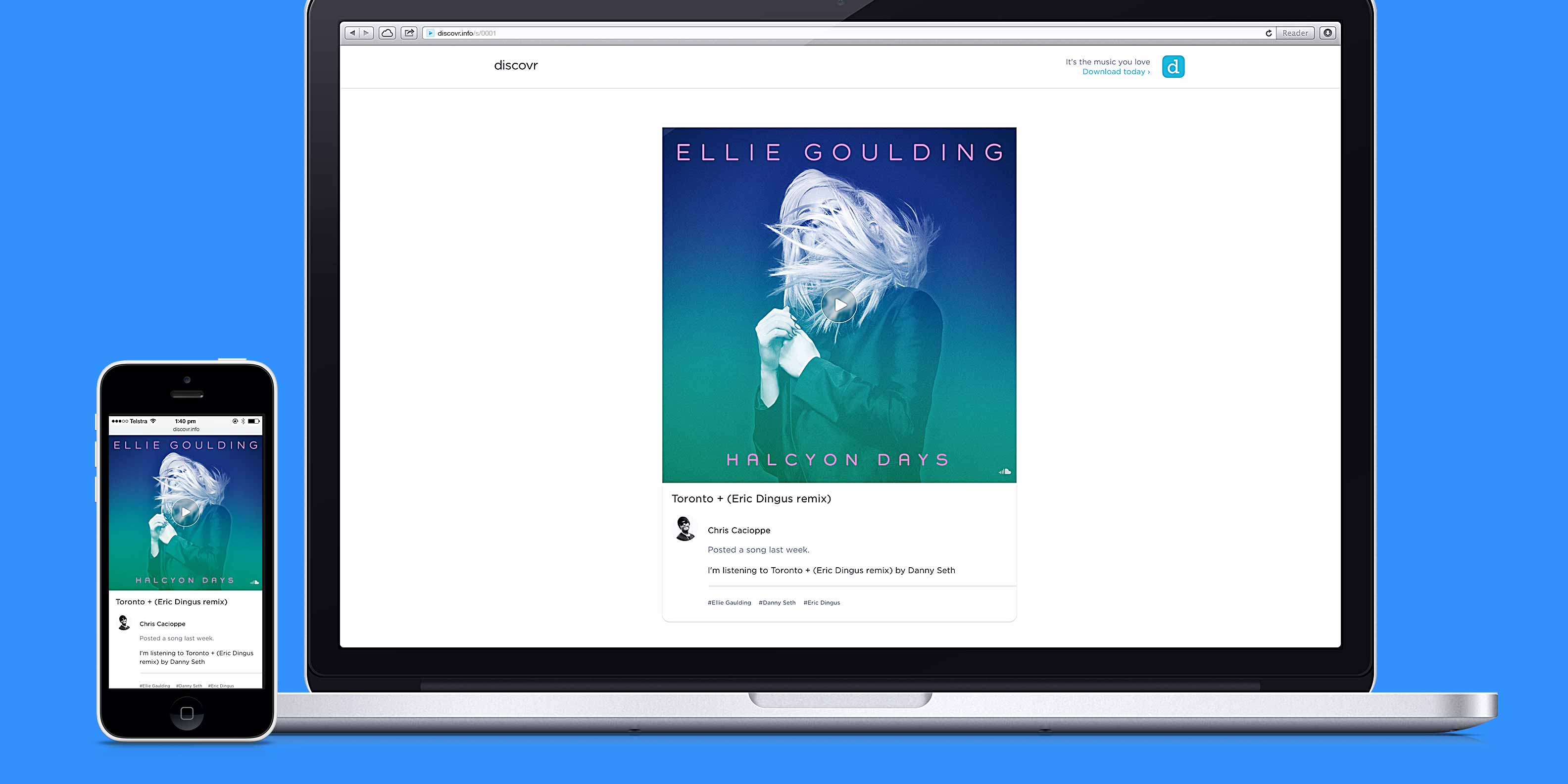
I also designed and built, with Callum’s help, the web stories that can be seen when anyone shares a post on the platform. This was great fun as Callum and I had total ownership over the web platform. The pages were lightweight on load so we could afford a soft but direct transition in which the content floated into view - only to be seen on screens larger 480px in order to maintain a quick and snappy mobile experience.
The public pages were only a small portion of what we created. I had been reading lots about keeping my codebase scalable and modular. Over a couple of months around launch, I had built a design system which would hook into Callum and Darcy’s intuitive rails framework. I could test new components and layouts with real data. The system featured a full suite of the foundational elements and built up to more complex components. Such as various devices for displaying content within activity streams, galleries and music catalogues.
Unfortunately the all good things must come to an end, and Discovr team disbanded in 2013.
Increasing Australia Posts conversion rate for password reset and inspiring the team to go beyond MVP.
Read more ›